Most mobile optimized sites are simply lite versions of the original with stripped down content and reduced functionality. However, with https://aaronknight.com.au/, which focuses on creating simple, clean, single column layouts; site visitors are served an optimized browsing experience allowing for easy navigation and interaction with content whether accessing from a desktop, tablet, or smartphone.
Top Benefits of Responsive Websites:
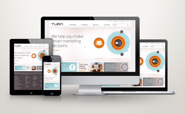
One Website. All Devices
The alternative to building one responsive site that adapts to all devices, would be to develop multiple sites to meet the needs of each individual device – one for desktop, one for tablet and so on. In addition to the expense of having to design and develop them separately, you’ll have to account for the effort required to maintain multiple sites instead of having everything together under one.
In the long run, a responsive website will save you time and money.
SEO
In addition to giving mobile optimized sites preference in mobile search results, Google openly endorses responsive web design. If these two factors aren’t enough, there are some other aspects to consider from an SEO perspective when looking at the benefits of having a responsive website. Hiring Fusion Las Vegas to help you design your website and hiring experts fromand hiring experts from bluehatmarketing.com/website-design-company/ can help attract more people to your site.
The first is usability. Google wants its users to have the best possible search experience and if they return immediately to the search results after landing on your non-optimized site – Google will surely make a note of it. Over time, your bounce rates will rise and rankings will drop. Another point to consider is the increased authority your site’s links will have. With a responsive design, a link to your main site is the same as your mobile site. Having your backlinks from both mobile and desktop versions of your site combines for a better backlink profile.
Visit the following to find out how to get your ideas across to a website designer to get the perfect website you always wanted.
Link Integrity
If you’ve ever come across an interesting article while browsing on a mobile optimized site, chances are you’ve shared it with your friends. You’ve probably even been the recipient of a few of these links to mobile optimized sites, which typically have a different URL all together than the same content had you accessed it via a desktop or laptop computer. This means when shared with a desktop user – the link will display mobile optimized content, which is extremely difficult to read or interact with while using a larger screen.
With responsive web design all URLs are consistent. There is nothing needed to distinguish between a mobile or standard versions of your site – users will always have reliable access to your content, no matter how they choose to access it.
Hey there. I was thinking about adding a
backlink back to your site since both of our
sites aare centered around the same topic. Would you prefer I link to you using your sie
address: https://www.ninthlink.com/2013/01/31/responsive-web-design-turn-com-optimized-for-all-device-sizes/ or blog title: Responsive Web Design: Turn.com Optimized for All Devicce Sizes .
Be sure to let me know at your earliest convenience. Cheers
Think local logical. Once upon a time in anhoetr era, I used to buy local cable spots..saved a lot of money over national buys and reached who I wanted to reach. Same concept in a post Thomas Friedman world. Good niche Cagora.